Have you ever been lost? Maybe you left Google Maps behind for a day. Maybe you were in a foreign country. Being lost, even for just a few minutes, is unsettling. You start to second guess yourself. If you’re lost long enough, you’d give anything for a good set of directions.
When you design the navigation for your credit union website, you are giving your users directions. Give them great directions, and they will quickly find the accounts and loans they want. Give them bad directions, and they may end up driving into a metaphorical lake.
Being lost is not a feeling that you want to evoke when visitors come to your website. If they can’t find what they want, they will leave. Your site’s navigation should be intuitive for as many users as possible. Just because a certain type of organization makes sense to you or your fellow credit union employees, doesn’t mean it makes sense to everyone. What’s the best way to simplify and improve your navigation? Usability testing. Card sorting and tree testing are two types of usability studies that will level up your navigation and make your users happier.
 Source: willowgarage.com
Card Sorting
The first method we suggest is card sorting, a type of crowd-sourced organization study. Card sorting will help you find patterns in how users expect to find content. In this task, you ask a broad number of testers how they would organize the content of your website, if it were in their power.
Step #1: Create your cards
First, you need to list every page on your site as a “card.” Be sure you have cards for every product and service you offer . Using software such as Optimal Workshop makes card sorting relatively easy, but you can also use sticky notes or 3×5 cards and have testers physically sort through the cards.
Step #2: Recruit participants
Card sorting is a test that can be performed by individuals or groups. Keep in mind that the exercise must be performed multiple times by different people. If you’re using individuals, try and get 7-10 participants. If you’re using groups, 5 groups of 3 (a total of 15 participants) is a good rule of thumb.
Whether you choose to use individuals or groups, make sure you select members from varied demographics. Not everyone should be around the same age, or the same gender. If you want to recruit some of your own credit union members, you could offer branch visitors a small incentive (such as a treat) to do the exercise while they wait to speak to a banker or loan officer.
Step #3: Conduct tests
Before you begin, give your testers instructions. Explain to them that their job is to organize the cards in a way that makes sense to them. Testers will then sort the cards into categories where they think they belong. Results may differ from tester to tester and group to group. For example, some might put “Auto Loans” in its own stack, whereas others might list it under “Personal Loans”.
Testers are welcome to ask you questions, but they should work mostly independently. For this reason, we’ve found groups more effective, since they are better at explaining their reasoning aloud as they work. What they say is important, so make sure you observe the exercise, and take detailed notes. Once they are finished, record the final results. If you are using physical sticky notes or index cards, take snapshots of the final organization. If you are using software, make sure you save the test.
Step #4: Analyze results
When you do this exercise, look for majorities. Where did most people place each card? You want the largest amount of people to quickly grasp your website’s organization. You will use the most popular card sorting choices to build your tree, which you can then employ in the next navigation test.
Tree Testing
Once you’ve finished card sorting, you can begin the more in-depth process of tree testing. This will test what you’ve already put together based on card sorting results and give you guidance on how successfully you’ve organized and labeled your navigation.
Tree testing presents users with specific tasks, such as “You’re concerned about a fraud attempt on your credit card. Where would you go to report that?” After getting the tasks, the user looks at the “tree” for the site (a drop down list of pages) and attempts to click through it to find the page that will help them complete the task.
Step #1: Create your tree
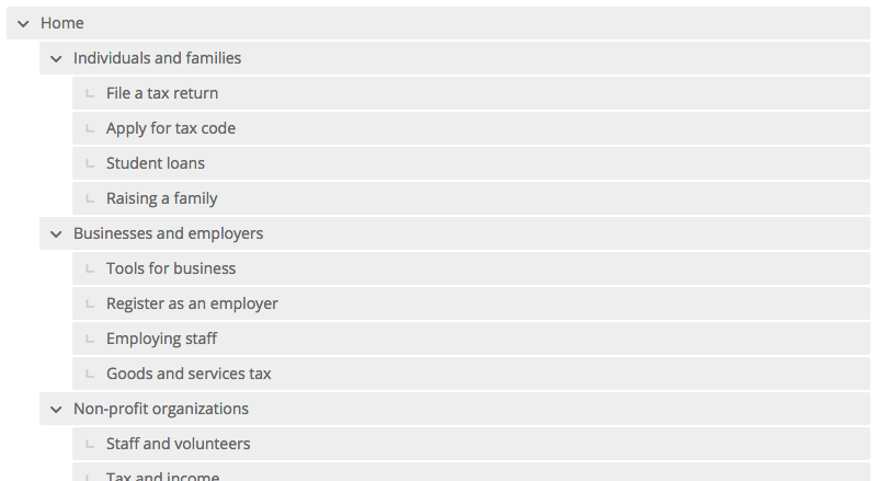
Enter your site map into Tree Jack, or another tree testing program. You will need to make sure that fields drop down, and deeper fields remain hidden. Make sure all pages are listed in your tree, including pages that will only serve for categorical or organization purposes on the live site.

A tree created in Tree Jack
Step #2: Create tasks
Once you have your list set up, you will need to create tasks for your testers. These tasks will be used to test how intuitive your navigation is, in terms of organization and labeling. You want the tasks to reflect real ways in which your credit union members and other site visitors would use your website. Also, make sure you don’t use the exact same language in your tasks that you do in your tree, or you’ll risk giving away the correct answer to each task without really testing the tree.
Here are some examples of relevant tasks to get you thinking:
- You need a new car and you’re ready to apply for a car loan. Where would you find that?
- Find the hours of operation for the branch nearest you.
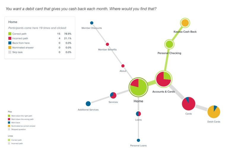
- You want a debit card that gives you cash back each month. Where would you find that?
- You want to repair your credit score. You know your credit union might be able to help you repair your credit. Where would you find that?
Step #3: Recruit participants
Sites such as Userbob and Mechanical Turk are good places to find inexpensive participants for your tests. We recommend using more participants than you did with card sorting. You should recruit at least 30 participants, and ideally more than 50. The more participants you have, the more helpful your data will be.
Step #4: Pinpoint problems

Data Analysis in Tree Jack
Once you have collected data from your participants, you can begin to pinpoint problems. Tree Jack will help you determine the result of a given task by giving you both the success rate (how often people got the right answer) and the directness rate (how often people went straight to a destination without backtracking).
Look for tasks that do poorly in one or both of these categories. For example, maybe people struggled to find the cash back debit card. Which categories were they clicking on? Where did the end up instead of the right answer? Knowing which tasks failed (and how they failed) will reveal the problems in your navigation. We suggest looking particularly at whether the pages involved had misleading titles, or titles that were confusingly similar to other titles.
Once you have made changes, be sure to run the test again. You want to double check that you have changed things for the better, not the worse. The more you test your tasks, the better your site’s navigation will be, which will lead to more conversions and greater user satisfaction.
Want more insights?
Get our crazy ideas and doable tips in your inbox.

