Unlike the Loch Ness Monster, Bigfoot, or a pack of snarling Yeti, the misconceptions people have about credit unions can do real harm. There are four myths in particular that dissuade people from banking with credit unions. As the number one touch point with your potential members, your credit union’s website is an ideal place to dispel these myths.
What are the myths?
In 2018, CUNA sponsored a detailed round of research—including focus groups, surveys, and other qualitative data—to get a better idea of how people perceived credit unions. They discovered four key barriers to membership: myths that keep people away from credit unions and stuck to big banks.
Myth #1: I can’t join
Why would someone bother with a credit union if they can’t become a member? Credit unions need to clear up eligibility confusion as early and prominently as possible. In our highly digital world, the most prominent place you can address this misconception is on your website. Adopt a welcoming tone and be immediately transparent. Your homepage is often the best place to start; and using personalization technology, you can deliver targeted messages to potential members.
When explaining your field of membership, use inclusive words. Phrases like “Anyone who…” or “Everyone who…” work well, as in “Anyone who works or lives in Delaware County can open an account with us.”
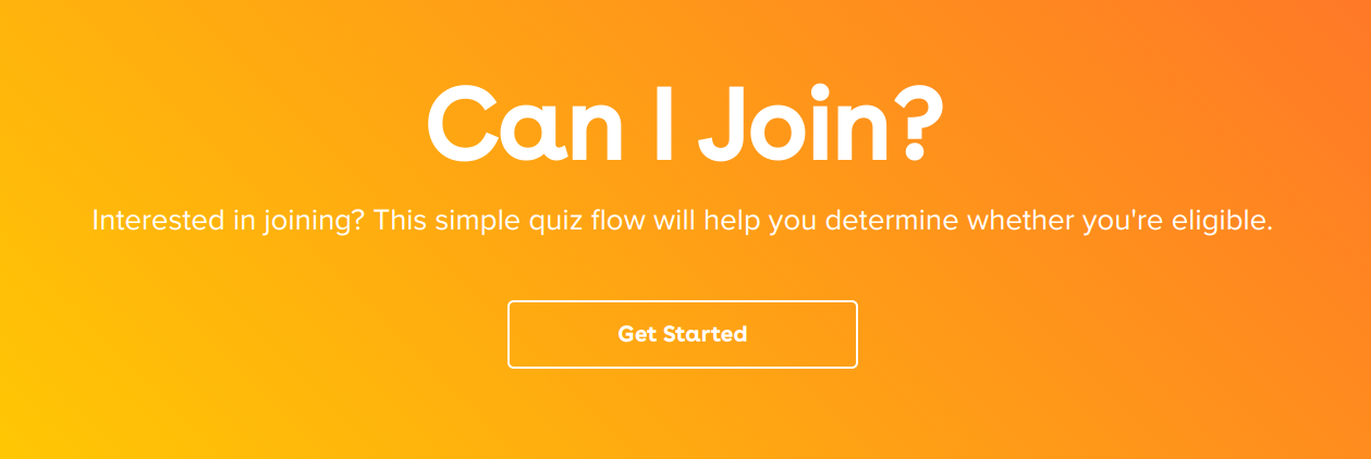
What if your eligibility requirements are complicated? This may require a little creativity. For example, OAS FCU’s website has a fun, interactive quiz right on the homepage to help people find out if they are eligible.

Eligibility quiz built for OAS FCU by an award-winning credit union website design agency (BloomCU)
Solutions: Use welcoming language, be transparent about your field of membership, and make it easy to determine eligibility
Continue reading about the other three myths on CUInsight.com


