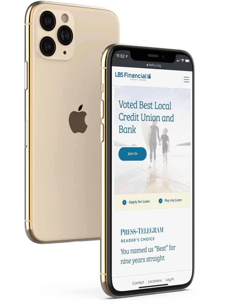
Right now, in the midst of an intense global pandemic, people are staying inside. They’re not going to restaurants, or gyms, or even to church. And they are certainly trying not to take unnecessary trips to the bank. Because of this, you’ve likely already seen an increase in traffic on your credit union website.
What you may not have realized: the change is here to stay. Recently, payments firm FIS conducted a large survey of COVID-era banking habits. Here are some of their key findings:
- 45% of respondents said they have changed the way they interact with their banks since the outbreak
- 31% of respondents stated they would continue to use more online and mobile banking in the future
“The impact of COVID-19 has rapidly accelerated trends that we have been seeing for years in terms of banking and digital payments,” said Mladen Vladic, general manager at FIS. “Once consumers begin using convenient new digital services, few tend to go back to their old habits, so we expect this to be the new normal going forward.”
In another recent study, JD Power found that only 46% of consumers will go back to “banking as usual.” The biggest changes will be increased use of mobile banking (20%), increased use of online banking (17%) and decreased uses of branches (10%).
With this massive shift, it’s now essential that you have a website (and mobile app) that’s up to snuff, or you could be left behind in the changing landscape. Even as things begin to return to normal, those who have discovered the convenience of digital banking may not come through your branch’s doors as often. And they might just switch providers, if they find an even easier option.
What can you do to improve your website?
With these facts in mind, there are three ways we recommend improving your website right now.
Design
The first: Design. People trust websites that are aesthetically pleasing. If your website looks like it was slapped together in 1999, now is a critical time for an update. A beautiful website can help people feel safe trusting you with their money in this financially troubled era.
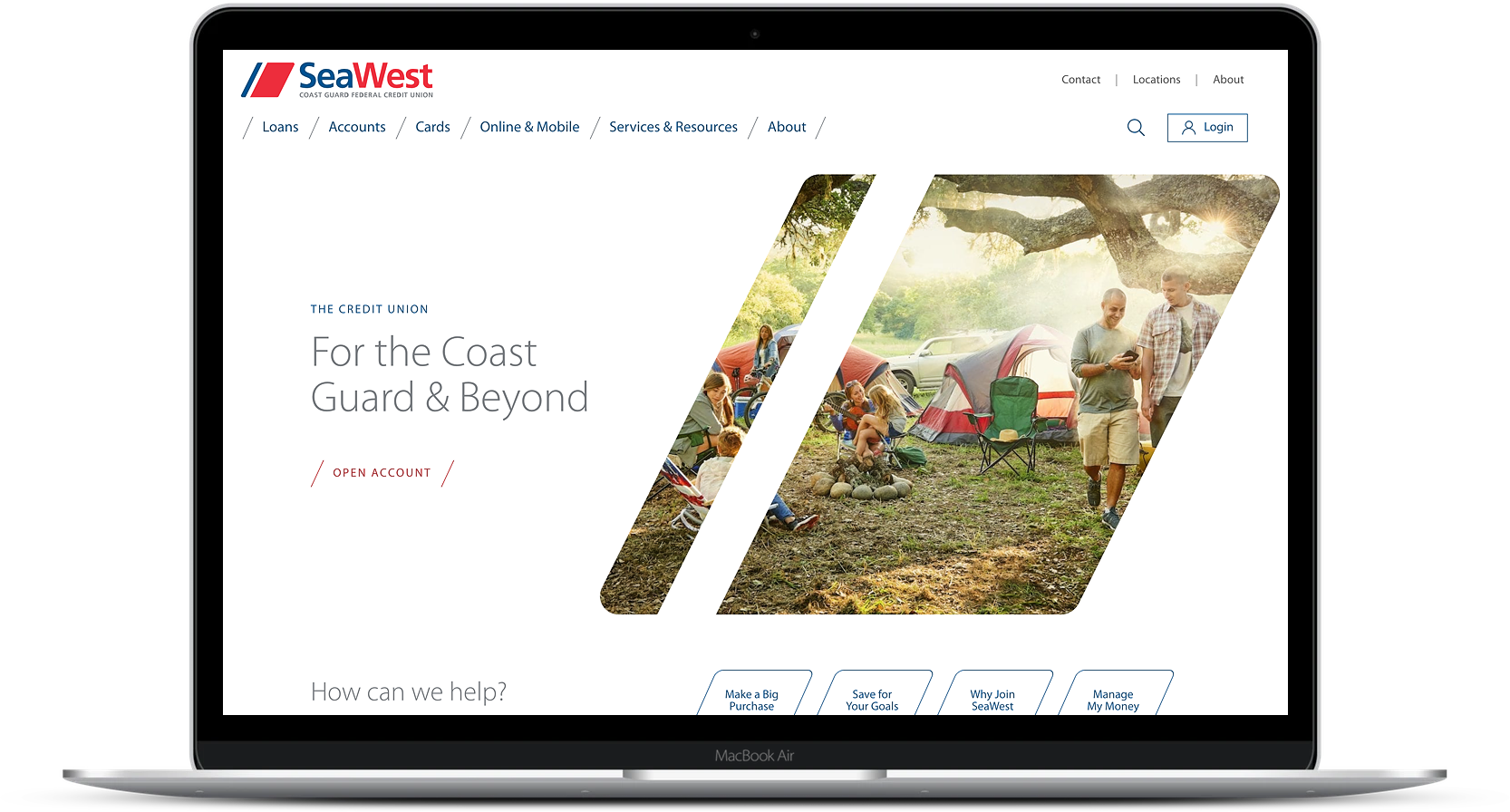
A new credit union website design for SeaWest.org
Functionality
Is it easy to apply for a loan, sign up for an account, or make a payment online? Is it even possible? These are essential considerations.
For an illuminating take on functionality, check out this article written by real students trying to sign up for accounts, cards, and loans at various banking institutions.
Notice how difficult it can be to complete these simple tasks, especially for tech-expectant Gen-Zers.
Keep in mind that some of these pitfalls are from top financial institutions. Unfortunately, the average credit union often falls far behind these basic benchmarks. By making key functionality improvements to your site and app, you’ll set yourself apart.
Service
Credit unions are famous for their superior member service. Your website should have the same reputation for excellence as the in-person experience you provide—after all, it’s your most important branch.
It should be easy for members and visitors to quickly look up products on your website, get their questions answered, and find your contact information.
Even as the pandemic subsides, investing in your website will not be something you regret. It will help you attract and retain younger members, and stay competitive in the digital age.

