Dave Power, CEO of Perkins School for the Blind, and professor of business at Harvard Extension School, calls the positioning statement, “the most critical element of company strategy.” It’s quite the assertion, but nailing your positioning statement really can help you connect with your potential members in a way that nothing else can. Most credit unions struggle to position their brands. If you can capture your credit union brand in a simple statement, than that clarity will help your best customers recognize you as something they need—which will lead to more conversions and greater membership growth.
In this post, we’ll discuss how you can write a positioning statement, both for your overall credit union brand and your specific products. We’ll also discuss the elements that are most likely to produce an effective positioning statement that leads to more loans, members, and deposits.
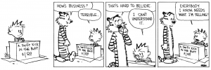
From Calvin and Hobbes
What is a positioning statement?
A positioning statement is a statement that explains key aspects of your brand or products. You might find one in a short paragraph, a sentence, or even divided up into pieces on a web page. Specifically, a positioning statement reveals three things:
- Who a brand or product is for
- How it benefits the consumer
- How it differs from competitors
Each of these elements is essential for a true positioning statement.
How do you write a positioning statement?
To get yourself in the right headspace to produce a positioning statement, you need to first think about the benefits you bring to your members. In marketing speak, benefits refer to problems that your products or brand solve for others. You can read a little more about this in our post that breaks down benefits.
Once you understand benefits, you can start writing your statement. You might consider a simple template like this one to get you started:
For [your target audience], [name of credit union] helps members [explain a benefit]. Unlike [name of competitor], we [what makes you different].
Let’s apply this template to a fictional credit union, “Three Cities FCU”:
For folks in the tri-city area, Three Cities FCU can help you plan a secure financial future. Unlike the big banks, we understand the needs of our community and give you one-on-one financial counseling.
A positioning statement doesn’t need to look exactly like this template, but it should include the three points mentioned above, in some form or another.
What is a product positioning statement?
Depending on how you are organizing your product pages, you may want to include a product positioning statement as well. Unlike a brand positioning statement, this does not encompass your entire company focus and strategy, but rather speaks to more specific needs of your members. Product positioning statements help you differentiate and distinguish the many unique options you have to offer. For example, you might have a positioning statement for your auto loans, share certificates, or HSA accounts.
Let’s say you’re writing a positioning statement for a Basic Savings account. You could compose something along these lines:
Looking for a savings account? This no-frills option is perfect for people who like to keep things simple. Plus, you’ll enjoy higher dividends than you could get from other banks or credit unions in our community.
Where should you use your positioning statements?
As a design agency for credit union websites, we include positioning statements right on the homepages of our clients’ new sites. You can see this done on OE Federal’s new website. Right on the homepage, we make it clear who OE Federal is and what they’re about:
- OE Federal is a credit union for members of labor unions
- It offers unique benefits tailored for union members (like strike relief)
- It understands union workers better than big banks do
You’ll notice that we’ve also broken up the positioning statement into different chunks. This is a common practice, but we do recommend writing the whole thing down in one place first. Once you know exactly where your credit union brand stands, you can start playing with the format.
You should also use product-specific positioning statements on your individual product pages. It’s the best way to clearly introduce a product so people will understand and engage with it.
We liked this example LessAccounting did for their “Accounting Software” landing page:

Source: Wordstream
As you can see, the landing page is based around a positioning statement. It address how LessAccounting makes life easier (benefits) for businesses (audience), and discusses how it’s simpler to use than Quickbooks (competitors).
What makes a great positioning statement?
A great position statement is concise, targeted to a specific audience, and emotionally positive.
#1 Concise
Many experiments across the web show that concise copy tends to convert at higher rates than wordy paragraphs.

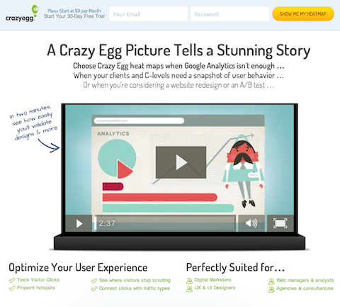
Crazy Egg saw a 13% increase in conversions when they parred down their copy.
It’s important to note that concise isn’t the exact same thing as short. Sometimes you need a few more words to explain your concept, especially in the financial sector. However, concise is always economical—it cuts out the fluff.
#2 Targeted to a specific audience
We will never really stop harping on this. It’s part of our fundamental beliefs as a company. The more you know about your audience, the more you can truly sell them on what they want. Addressing the potential member directly, pointing out the benefits you can give them, and setting yourself apart from your competitors, all require some knowledge of your audience.
We like this example on the Dropbox Business homepage:

In their blurb, they call Dropbox the solution that “employees love and IT admins trust”. This shows how well they know their audience. Dropbox knows that it’s IT admins who are most likely to be making the decision on which storage space option their company uses, so they address that upfront in their copy.
#3 Emotionally Positive
People are drawn to positive copy. Harvard Business Review found in a study that people are more attracted to campaigns that make them feel positive emotions. When you speak about your competitors, there might be a temptation to go negative, but try to avoid it if you can. You want to explain why you’re better, not why you are “less worse”.
For example,
“We offer higher dividends than our competitors.”
Works a little better than
“Our competitors offer horribly low dividends, but we don’t.”
The first sentence is much more positive, and also more concise.
In his own A/B test, Michael Aagard ContentVerve added a security disclaimer to one of his forms, which declared, “100% privacy – we will never spam you!” However, this disclaimer actually decreased conversions instead of improving. He suspected the reason was because the copy was too negative. Even though he was trying to reassure users, he ended up drawing people’s attention to the word “spam.”

Adding negative copy decreased conversions.
Conclusion
You are not writing a position statement just to use it on your website, though that would be reason enough. You are also writing it to better understand your own credit union brand. A positioning statement forces you to think about your members, strengths as a credit union, and competitors. It’s an incredible resource that can be used again and again to sharpen your marketing and grow your credit union.
Want more insights?
Get our crazy ideas and doable tips in your inbox.


